Below is a sample of some of our artwork. If you are interested in retaining our services or want us to make a proposal on a job, contact us at the email address at the upper right of this blog.
Note: All of these designs, in whole or in part, are copyright by Oakhurst Technology 2005. Republican anywhere, for profit or not for profit, without the expressed permission of Oakhurst Technology, is prohibited.
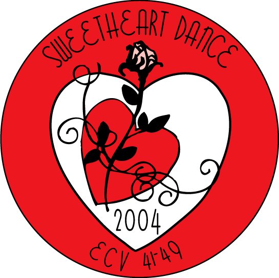 This is a button designed for a Valentine's Day dance. The heart was drawn by hand, then a search was done for an appropriately "romantic" font. The inner heart and flower were found during a clip art search and then were edited and manipulated for the best effect. Note how the vines in the flower complement the feminine-looking 1930's-style font.
 This design was done for a landscaping service, Beck's Property Services. The client said he wanted to incorporate the color green (in this case, we used a very dark forest green) as well as palm tree. A clip art search was done for palm trees and the palm trees found were then manipulated by hand to achieve maximum effect. The sun was placed in the upper left corner to fill in a blank space.
Then, the sun's colors were used in the "groundline border". The "Becks" font is a 1930's-style Art Deco font with a classy feel. The "Property Services" font is a modern font with a similar classy, refined appearance.
 This t-shirt artwork was done for a girl's rodeo club. The client already had this great logo and our job was to find a "distressed" look similar to an old t-shirt or worn leather. The existing logo was also further manipulated to achieve the maximum desired effect. The holes were "punched through" the distressed look filter screen to turn the "C" into a horseshoe.
 This poster was done for a class intended as a parody of products that try to target children with their marketing. Note the use of "kiddie" fonts and the "old-time cola" font on the bottle.
 This artwork was done for a t-shirt for a vintage car rally featuring Pontiacs. One Pontiac from each era (50's, 60's, 70's) was chosen. A high-quality photograph was scanned into the computer and was hand-traced and colored. An appropriate "50's-style automotive" font was chosen.
 This design was done for a local auto repair shop in town, Lit'l Joe's Automotive Repair. The shop had a mascot vehicle and wanted a drawing of it to be part of the logo. The "Lit'l Joe's" font was chosen for its playful, child-like quality. The "Automotive Repair" font was chosen for its "polished steel" appearance. The wrenches originally were clip art that was hand manipulated.
 This design was done for a local construction company, Kris Koontz Construction. The owner wanted realistic images of the company's three major pieces of construction equipment to be represented. The vehicles were traced by hand with a mouse after high-quality photographs were scanned into a computer.
Another design for the same local construction company as above. The same fonts and basic design were used as in the previous logo to retain the company identity. The mountains in background were created by hand manipulating clip art.
 This design was done for a local skateboard shop. The owner had found the "Tiki-Man" image and we redrew him to create the logo. A surfboard shape was placed in the background as well as a skateboard shape to convey the products sold by the shop.
 This design was done for a local tattoo shop. The owner had a personal sketch and idea of how he wanted the logo to look. A "distressed" background was used and thousands of fonts were researched to find one that had this particular "rubber stamp" effect that the owner desired.
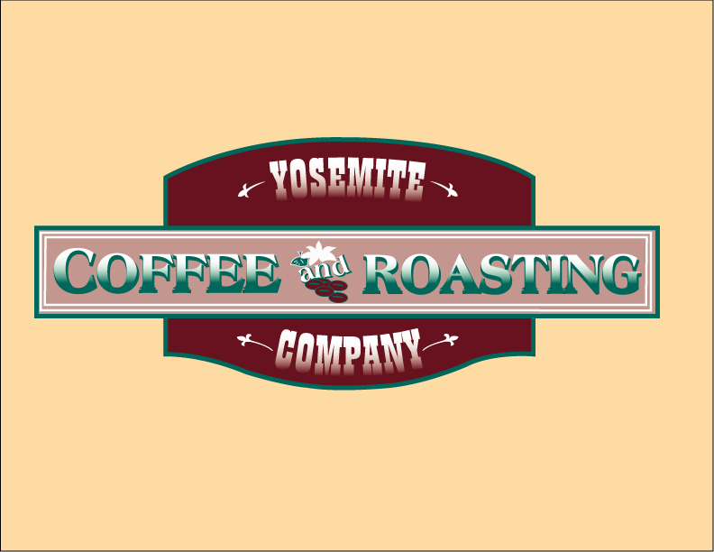 This design was done for a t-shirt and poster for a popular local coffee shop, the Yosemite Coffee and Roasting Company. Our job was to recreate the original logo using only an old t-shirt and a blurred jpeg. The original fonts were researched and recreated and all shapes were redrawn by hand with a mouse. I used to hang out at this coffee shop a lot but I don't anymore now that they are closing at 2 in the afternoon. That's way too early for night owls like me.
 A faux movie poster done as a class exercise. Note the use of fonts particular to the era as well as the use of the classic "movie credit font". All fonts and elements were manipulated and placed by hand.
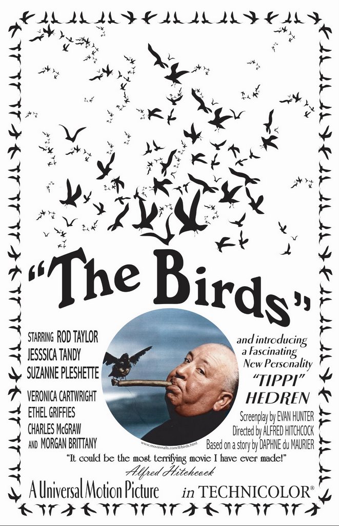 A faux movie poster as a class exercise. Once again, note the use of fonts. We consider ourselves experts at font usage.


No comments:
Post a Comment